Website gets update: more is to come
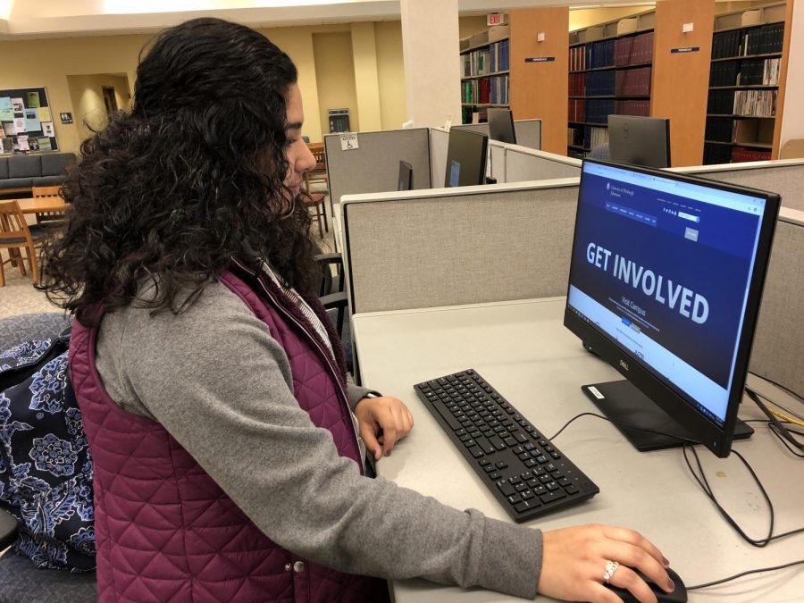
Sophomore Ana Gonzalez looks at the newly updated Pitt-Johnstown website Nov. 8 in Owen Library.
November 14, 2018
Visitors to Pitt-Johnstown’s website may have noticed a fresh design after a Nov. 2 revision to its home page.
A video presentation on the home page shows campus photographs and drone footage with typed messages about getting involved, making a difference and embracing the world.
Digital media manager Mike Morlacci, who has worked at Pitt-Johnstown for almost six years, is responsible for revising Pitt-Johnstown’s website.
“We sought to familiarize the web visitor with an informative video that incorporates images of campus, aerial footage, our people and the up-close instruction that defines us,” he said.
The revision happened almost two months after Pitt-Johnstown President Jem Spectar said at a Sept. 19 Faculty Senate meeting that he had reviewed the website over the summer and determined that information was not accessible to prospective students.
“We just found that our own website itself was not user-friendly to a prospective student and information was out of date,” Spectar said at the meeting.
Spectar also said he directed a short-term fix to revise the website and that a broader fix is to be completed over the next year and a half.
Sophomore Charles Howard said he had trouble searching for academic majors’ information on the website’s previous design.
“To be honest, everything (was) just indirectly there,” Howard said.
“They say it’s always there, but it (was) not really organized the way you think it would be for a college.”
Howard said Spectar’s decision to revise the website proves that students’ concerns are taken seriously by campus officials.
“I think it’s cool. It shows they’re listening to students.
“It’s great,” Howard said of action taken to update the website.
Morlacci said the “apply now” and “give” tabs, where prospective students can print applications and learn about academics and donors can give money to the campus, are to be revised next.
“Because the home page is the world’s window to us, we wanted the first sight to be something gripping and beyond the standard web appearance.
“The best is yet to come,” Morlacci said.


